

AI SEO, LLM Optimization & Generative Engine Optimization
Let’s be honest about something: the way people find information on the internet is changing faster than most businesses can keep up with. Not in a “we should probably update


Let’s be honest about something: the way people find information on the internet is changing faster than most businesses can keep up with. Not in a “we should probably update

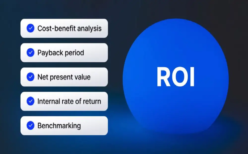
The hardest thing about AI search optimization isn’t the strategy; it’s the measurement. Traditional SEO gave you clear metrics: rankings, organic traffic, and click-through rates. You could open Google Search

There was a period in digital marketing when the content volume game made sense. Publish frequently. Cover every keyword in your category. Build the biggest content library in your space.

Local search has always operated by its own rules. The tactics that win national organic rankings, massive content programs, thousands of backlinks, and domain authority accrued over years don’t always

There’s a familiar story in B2B sales: the deal that falls out of nowhere. You were never in the conversation. The prospect went to a competitor you barely knew you
There’s a thought experiment worth doing. Imagine every piece of content you’ve published in the last three years. Now imagine an AI that has read all of it along with